Barack Obama
Barack Obama: Contribute
Obama For America
Contribution Platform
We are being out-spent 4 to 1.If we don't make up the gap, we will lose this election.
Innovating for the Commander-In-Chief
We had a tough problem to solve. We had the support of a massive network of grassroots supporters giving between $5 and $50 when asked, but that wasn’t enough. We needed to make online donations easier, faster and more accessible.
We needed to take more risks.
The first question that came to my mind was: ‘How do we innovate on a fundraising platform that, because of the 2008 campaign, was already perceived as successful?’
ESTABLISHING A BASIS
We had starting information in the form of best practices and early-stage testing to validate our hypothesis but we had to decide whether we could run larger changes and estimate gains/losses based on this data. We didn’t have time to continue testing every little change. We had to be smarter and faster — we had to couple changes together and read the data in a more comprehensive way.
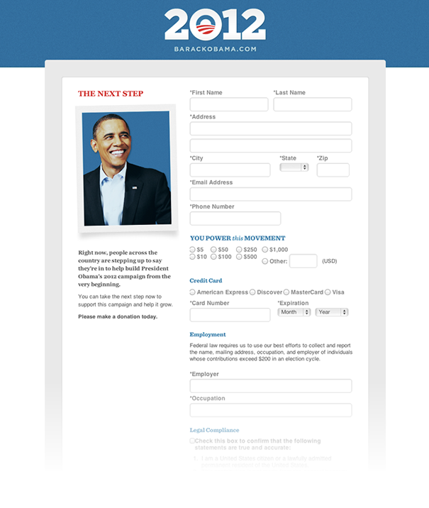
The standard web-form had not been drastically changed in years. People have tried modifying basic inputs and styles but the results have either been impossible to use or a step-back visually.
We needed to figure out a way to improve it and reduce the barrier of entry for all users. This was a unique challenge because our target audience could vary from a young supporter that works on computers for a living to a 48 year-old mother of two that is a partner at a law firm. Being able to build a single experience that can both excite any type of user & allow them to easily fill out the form is not an easy thing to accomplish.
We did, however, have a great advantage: an un-ending audience to run a/b tests on and a fresh flow of volunteers for user research.
So, we started taking larger, smarter risks.
The Road To Sequential
STAGE 1
We defined a few key points we needed to hit with new iterations of the page:
Difficulty
How hard is it to fill out the entire form? Are labels clear enough to avoid errors?
Effort
Does the form take the least amount of effort possible to fill out? How tough is the task if the user doesn’t have their credit card in from of them?
Enjoyment
Is the task of filling out this form terrible? How can we make it enjoyable for a user to get through each section?
Satisfaction
After a user donates, how can we reward them so the process is more satisfying? How can we show the impact they are making in this election?
Speed
On our end, how can we speed up our pages? We have a high barrier of entry for donations already, so we need the page load to be as quick as possible.
On the users’ end, how can we speed up the process? Since we can’t remove any fields, how can make the user perceive the entire process to be significantly faster?
Stage 2: REST, EC2, Jekyll & Akamai
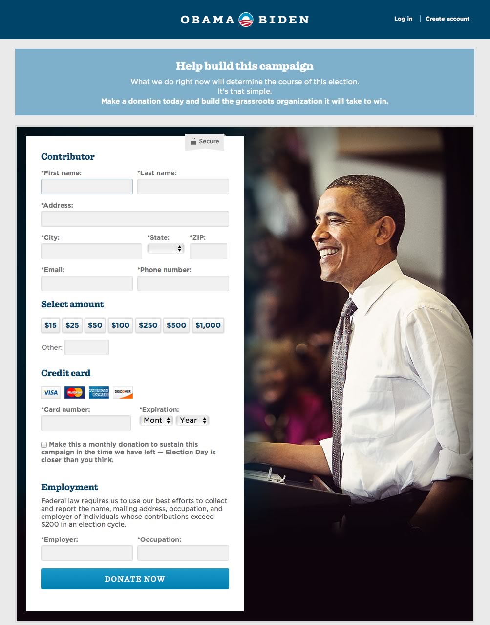
The Entire Platform Needed A Revamp
Kyle Rush, the deputy director of development, wrote out a great post detailing all of our changes when we moved from BlueState Digital to our new internal donation platform. In a very broad description, it was based on a REST API on EC2 with Jekyll rendering static HTML behind Akamai. If you’re interested in the details behind this, you should definitely give it a read. I have also gathered all of the other articles written about OFA tech/design/dev, etc on my blog here.
60% Faster
These changes drastically improved paint times for our donation pages. Originally, it would take over 4 seconds to start rendering HTML on our pages. After the change, it took under 1 second.
Improved Look
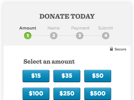
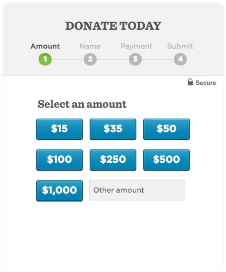
Along with these changes behind the scenes, we implemented some over-all improvements to the long form including a complete re-design from Ryan Roche. He implemented a massive set of changes to include the design & readability of the overall form, and to improve the eye-scan pattern of the page. He included a brand new set of Amount buttons that improved conversions and increased average donation amounts.
Stage 3: Gradual Incline vs Steep Slope
Sequential is born
Kyle came up with the idea of completely changing the form. We knew we had to make some drastic changes, and this one was definitely one that Ryan and I were excited about. By breaking the form up, we knew we would be able to tackle some brand new UI & UX problems and get some really valuable data back from our tests.
Endless Iteration
Ryan and I spent a tremendous amount of time working together during this stage of the campaign. We knew how important fundraising was so we put all of our efforts into this for months.
We began iterating over various concepts that we all referred to as "sequential." We settled on splitting the form into 3-5 steps and built versions for each of these. I started exploring various CSS3 transitions in order to create some interest between each step. We also experimented with simple sliding transitions to full 3D Transforms that rotated the entire module.
Light at the end of the tunnel
We began seeing some consistent and exceptionally promising results from our A/B tests. We knew we were headed in the right direction so instead of experimenting with things like transforms and transitions, we began optimising the form itself to improve the speed at which a user could complete it.
Based on the data we acquired through our various A/B tests with sequential, we deduced that by 'turning the long donation form into 4 smaller steps we increased the conversion rate by more than 5%.'
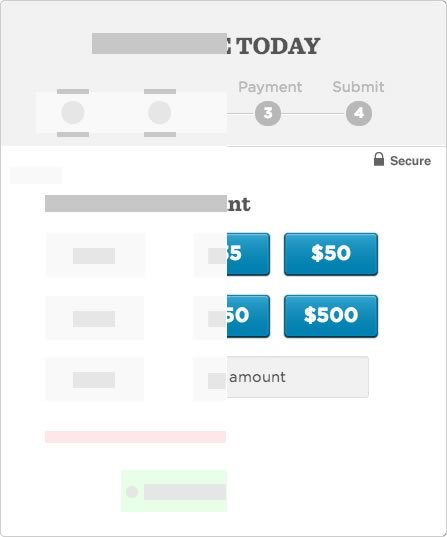
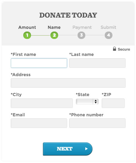
We also introduced in-line input validation so users would immediately see errors in their information. Originally, a user would need to complete the entire form and hit submit before they were notified of an issue. This, obviously, was not efficient and left room for improvement. So we improved it. The in-line validation reduced server errors by over 70%.
Since we had such solid ground with Sequential, we knew we could test alternate improvements for the user. Kyle had already optimised our 'Quick Donate' platform to be incredibly powerful, we so started bringing that power onto contribute. Sequential became smart enough to know about the various user states:
- New User
- Existing User, Logged Out
- Logged In User, New Donor
- Logged In User, Existing Donor
- Logged In User, Existing Donor with Saved Payment Information
Each of these user states affected sequential in multiple ways in order to make best use of the users time. Example: A logged in user with saved payment information would get 2 steps: 'Choose Amount' and 'Confirm/Submit.'
Sequential All The Things!
The success of sequential was great news, but it did not mean the end of our testing. By early September, Sequential had been adopted as the default donate page and the tests were rolling out daily to improve it and get to the next level of innovation.
We increased donation conversions by 49%, sign up conversions by 161% and we were able to apply our findings to other areas and products.
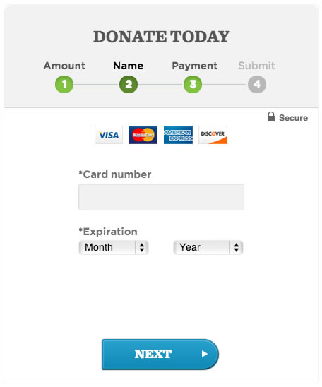
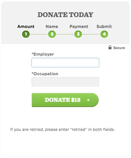
The Obama For America'Sequential' Donation Module
On mobile, the Sequential collapses to the standard full list of inputs. Here is a set of screenshots illustrating the progression through Sequential Donate on screens larger than 700 pixels wide.
The latest @barackobama donate form is really wonderful.I love the multi-step flow & how elegant quick donate looks. contribute.barackobama.com
— Anthea Watson Strong (@antheaws) August 24, 2012
Obama's donation form is an unexpected masterpiece of visual and interaction design: contribute.barackobama.com/donation/index…
— Jeffrey Wear (@wear_here) September 18, 2012
"Turns out you can get more users to the top of the mountain if you show them a gradual incline instead of a steep slope."
Obama For America, 2012